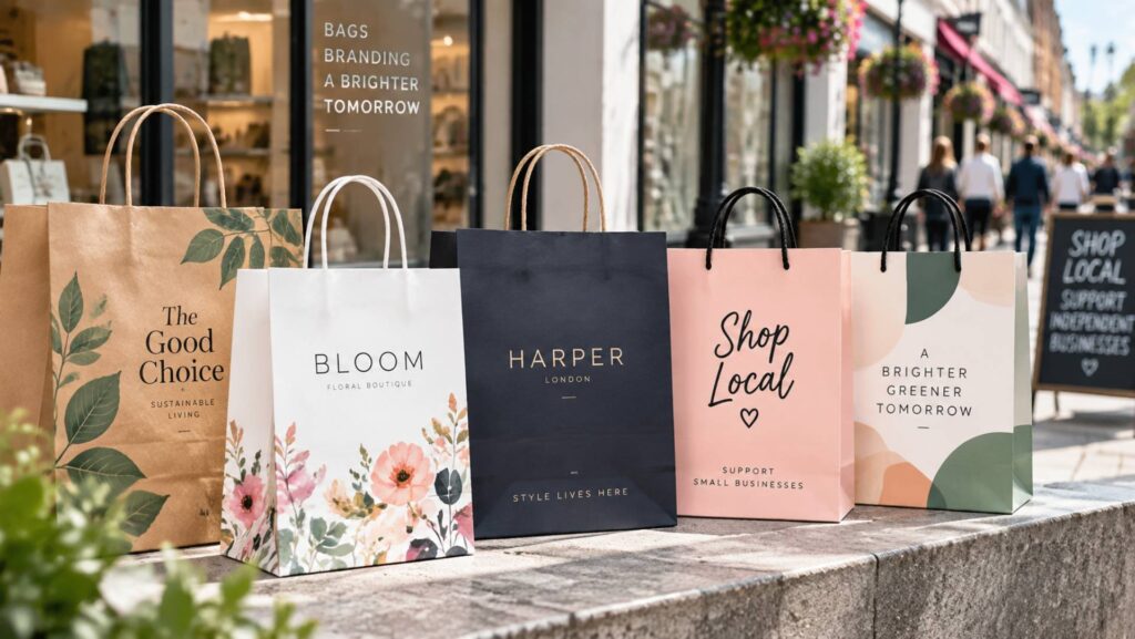
A great paper bag can do more than carry a purchase. The right artwork turns everyday packaging into moving brand visibility. Clear logos, strong colours and balanced layouts help retail packaging look distinctive, professional and memorable, giving businesses another effective way to be noticed on a busy high street today.
On a crowded high street, customers notice strong visual details quickly. Packaging can therefore become part of a brand’s identity after someone leaves the shop. Well-designed printed paper bags give retailers a practical way to present logos, colours and messages in a format that travels with the customer. The artwork does not need to be complicated to work well. Simple designs are often easier to recognise from a distance. By planning layout, colour, scale and print quality carefully, businesses can create branded bags that look polished, suit their products and support a clear, consistent identity wherever they are carried.
Start With One Strong Visual Focus
Decide what people should notice first. For most brands, this will be the logo, perhaps supported by a short strapline. Avoid filling every available space, as too much information can weaken the design.
Leave enough clear space around the main artwork so it remains recognisable when the bag is moving, folded slightly or viewed from several metres away.
Choose Colours for the Finished Bag
Use established brand colours rather than shades that simply look attractive on screen. Where accurate matching matters, provide Pantone references.
Also consider the paper itself. Natural kraft, white paper, coloured stock and laminated finishes create different backgrounds. Strong contrast helps logos and text remain visible, especially when customers see the bag quickly rather than studying it closely.
Prepare Artwork for Clear Printing
Artwork should suit the actual bag size, handles, folds and available print area. Logo placement that works on a screen may feel too small or awkward once printed.
For printed paper bags, vector formats such as AI, EPS or suitable PDF files can help logos and graphics reproduce sharply. If artwork is not production-ready, professional artwork support can prepare or redraw it before printing.
Match the Design to the Bag Style
Twisted-handle, flat-handle, luxury and laminated paper bags each create a different impression, so the artwork should complement the chosen construction.
A refined bag often works well with a restrained layout, while kraft paper can suit bold, simple branding. Whatever the format, keep important details clear of handles, folds and edges so the design stays balanced and easy to see.
Review the Proof Carefully
Before approving production, check spelling, logo proportions, placement, colour references and overall scale. If several sizes are being ordered, make sure the branding remains consistent across them.
Look at the proof from a customer’s point of view. The logo should be quick to recognise, text should be readable and the overall layout should feel balanced rather than crowded.
FAQs
How much information should appear on a paper bag?
Keep it focused. A logo, brand colours and a short message are usually enough.
Can brand colours be matched accurately?
Pantone references can be supplied to support consistent colour matching.
Which artwork files are suitable?
Vector files such as AI, EPS and suitable PDF files help graphics remain sharp when resized.
Does paper colour affect the artwork?
Yes. Kraft, white and coloured papers change contrast, so the design should suit the selected stock.
Why should I check a proof?
It allows you to review scale, position, spelling and colour details before production.
Closing Thoughts
Effective bag artwork comes from clear decisions rather than unnecessary complexity. Start with one strong visual focus, protect the space around it and choose colours that fit your wider brand identity. Then consider how the design will work with the selected paper stock, handle style, bag size and finish. Using suitable artwork files and checking the proof carefully can also help the finished packaging reflect the intended design. These details may seem small, but together they influence how professional and memorable the finished packaging appears.
Most importantly, think beyond the computer screen. Retail packaging is carried through shops, streets and public spaces, where it will be viewed from changing angles and distances. When logo size, contrast, colour and placement are planned for these real conditions, printed paper bags can become a practical extension of a retailer’s identity, helping the brand appear consistent, recognisable and more noticeable on the high street.